Estée Lauder's New York Renaissance
Rebranding Estee Lauder to create a timeless feel that resonated with their new audience.
Brand Strategy

Project Overview
Timeline: November, 2025
My Role: Competitor Research, Brand Strategy, Visual Identity Packaging Design
Tools: Photoshop, Illustrator, Pacdora, Gemini
Estée Lauder needed to attract younger audiences in India without losing its luxury legacy or cannibalising sister brands like Clinique and Bobbi Brown.
Through competitive research, we noticed that most beauty brands lean heavily into their cultural origins - Paris, Korea, Japan. Estée Lauder had an untapped story: New York. We saw an opportunity to weave the brand's origins into its DNA in a way that felt fresh, not nostalgic.
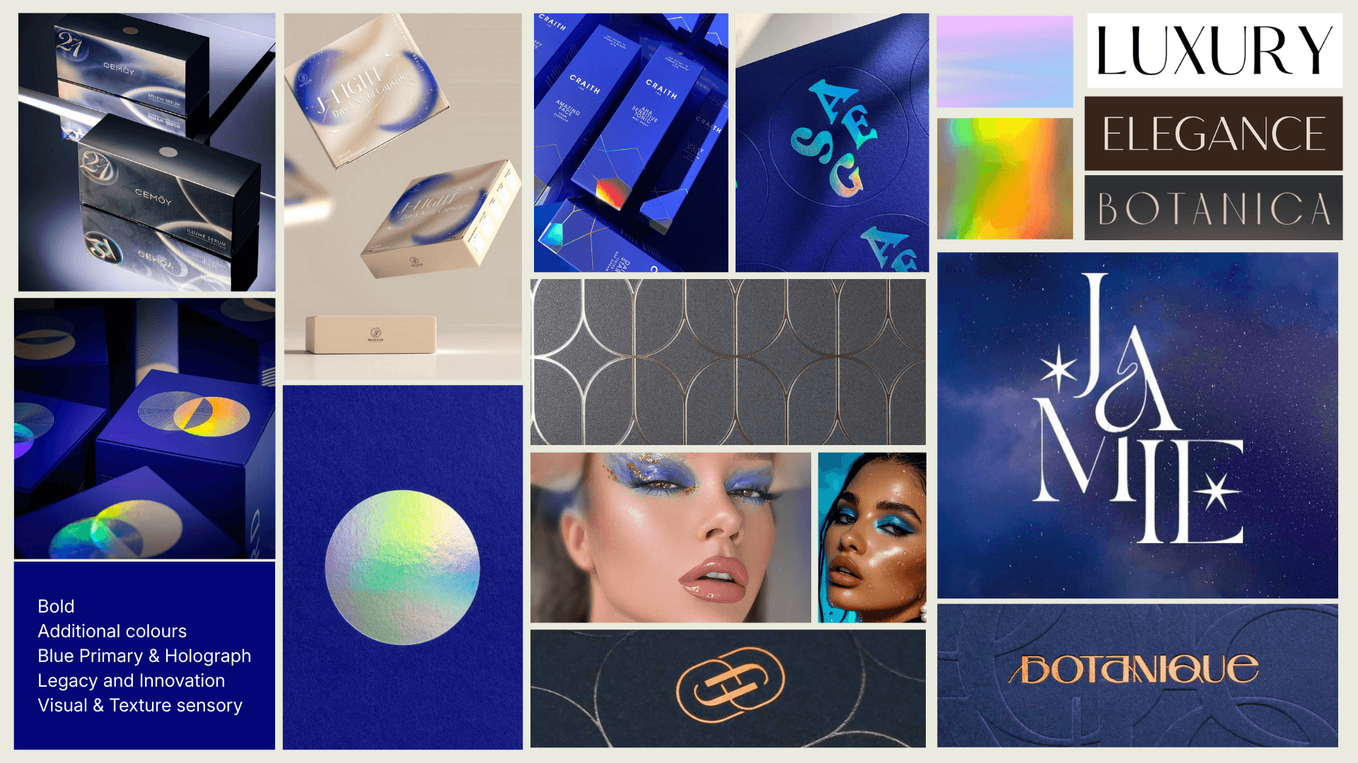
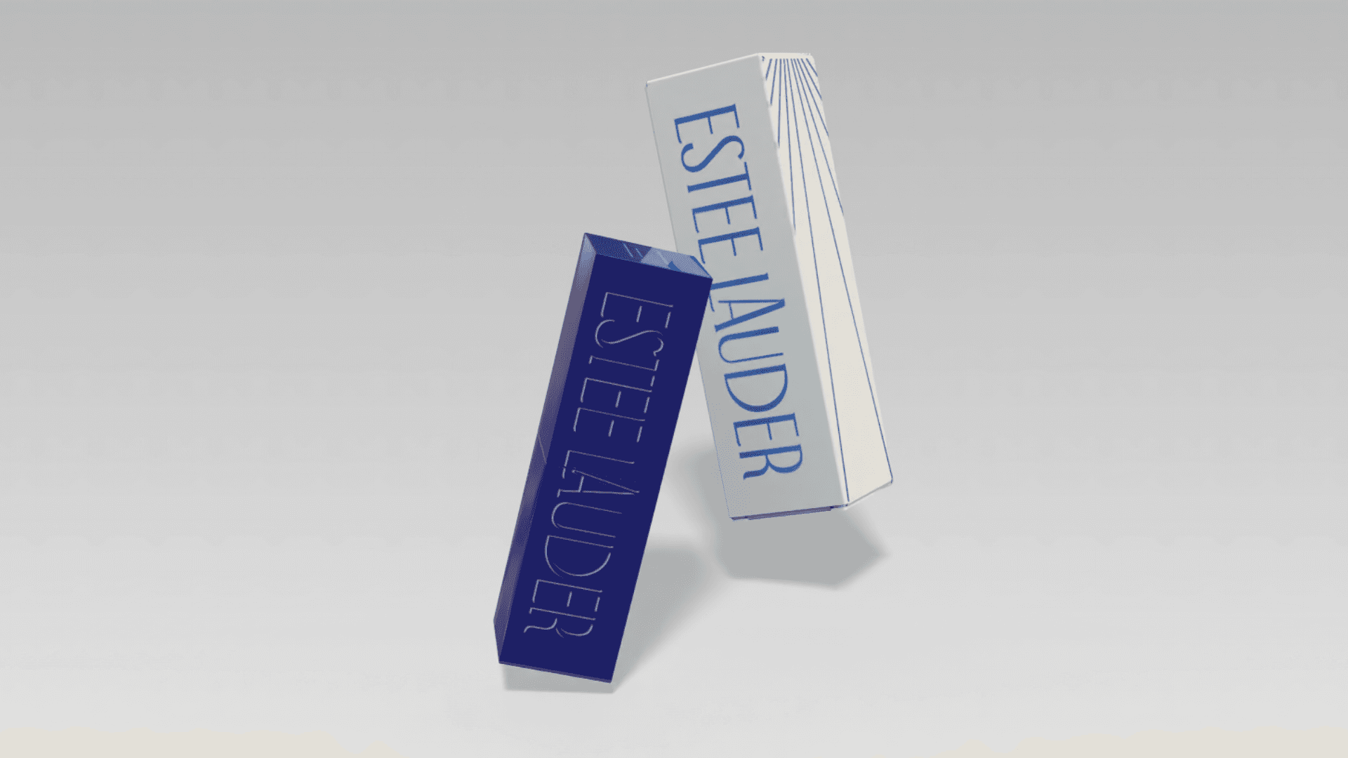
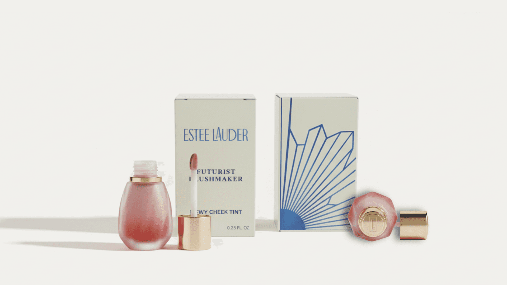
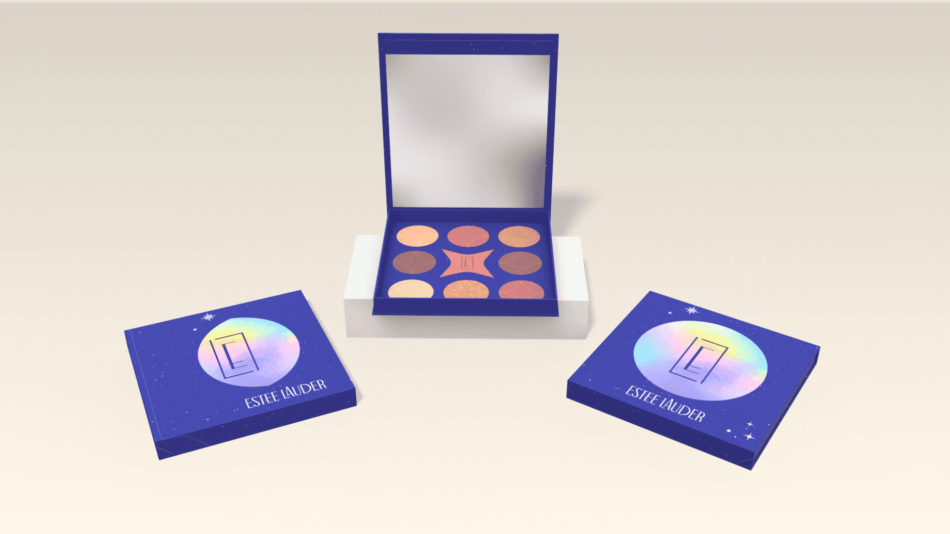
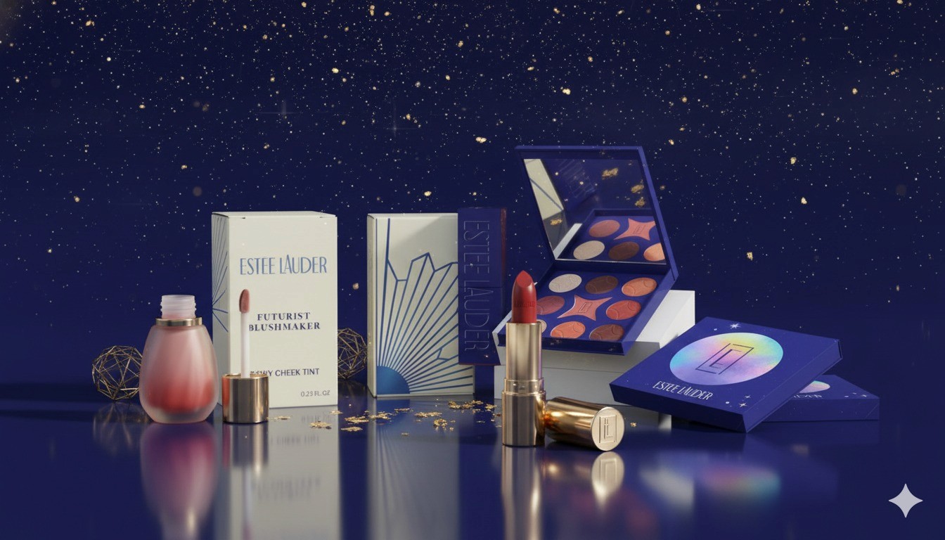
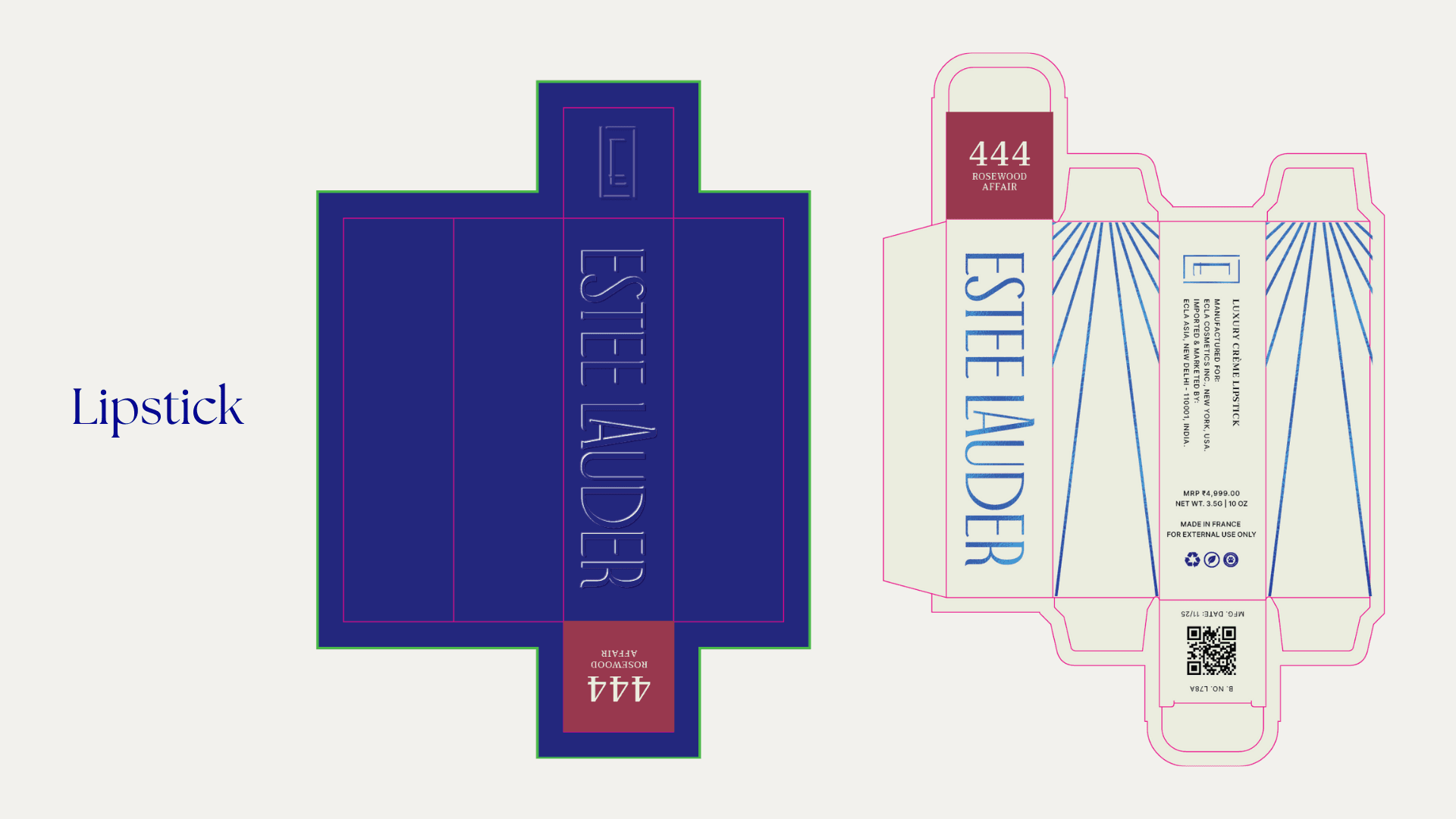
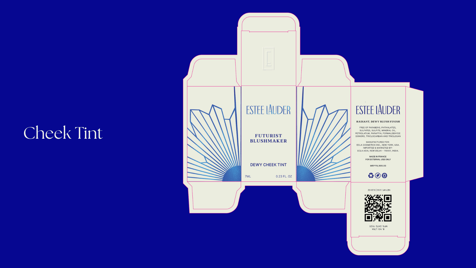
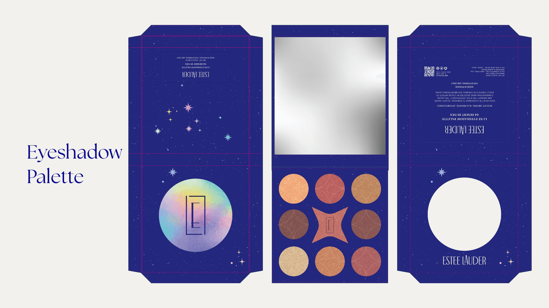
Our approach focused on Art Deco, a distinct departure from the Art Nouveau aesthetic dominating luxury beauty. Subtle architectural details remind you of New York without being literal. The logo's raised 'A' nods to the Empire State Building. We introduced celestial motifs like stars, constellations, eclipses as Estée's signature element, much like how Tiffany owns their blue.
The packaging system tells time: sunburst patterns for day products, holographic moons and constellations for evening. It's functional storytelling that elevates the unboxing experience.
The result is a bold visual identity that bridges generations, honouring Estée Lauder's timeless elegance while speaking to a modern, aspirational audience.